Impact Summary: This measure supports the Inpatient Rehabilitation Facility Quality Reporting Program by assessing facility-wide hospital-onset Clostridioides difficile infections (CDIs) among patients in inpatient rehabilitation facilities, an outcome closely tied to patient safety and infection prevention.
Based on the most recent data, the total estimated number of CDIs across all deciles is approximately 1,500. If inpatient rehabilitation facilities with higher CDI rates improved their performance to levels observed among better-performing facilities, this would result in about one less CDI per facility, indicating limited opportunity to improve patient outcomes.
For this measure, Battelle reviewed the following publicly available datasets available at Inpatient Rehabilitation Facility - Provider Data | Provider Data Catalog (cms.gov):
- Inpatient_rehabilitation_facilities_03_2026.zip (which contains data from April 2024-March 2025 and is referred to as year 2024 in this assessment)
- Inpatient_rehabilitation_facilities_03_2025.zip (which contains data from April 2023-March 2024 and is referred to as year 2023 in this assessment)
- Inpatient_rehabilitation_facilities_03_2024.zip (which contains data from April 2022-March 2023 and is referred to as year 2022 in this assessment)
- Inpatient_rehabilitation_facilities_03_2023.zip (which contains data from April 2021-March 2022 and is referred to as year 2021 in this assessment)
Battelle analyzed all values for “I_015_01” not marked as “Not Available” from the corresponding Inpatient_Rehabilitation_Facility-Provider_Data.csv file.
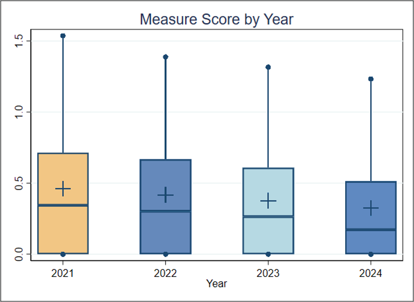
About Figure 1: Figure 1 is a boxplot that shows how scores have changed based on the most recent 4 years of data available. For each year, the boxplot displays a box with lines and dots to help visualize the range and distribution of scores. The dots represent the points where the lowest 5% and highest 5% of scores fall, and the line connecting them shows where 90% of the scores are located. The box itself covers the middle half of the scores, from the 25th to the 75th percentile. Inside the box, a horizontal line marks the median score, which is the middle value, while a “+” sign shows the average score. This type of graph makes overall trends in scores over time as well as the consistency and spread of the results easier to understand.