Impact Summary: This measure supports the Inpatient Psychiatric Facility Quality Reporting Program’s goal of improving patient safety and patient experience by measuring the total number of hours that patients admitted to a hospital-based inpatient psychiatric setting were maintained in physical restraint.
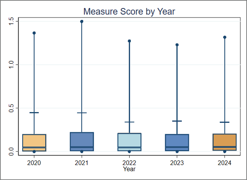
Performance has stayed very steady from 2020 to 2024, showing consistent performance among inpatient psychiatric facilities. The mean performance is driven by very high scores in the top two deciles. If the average performance of Decile 3 in 2024 (0.009) is considered a plausible, achievable score, and the facilities in Deciles 4 through 10 improved to reach that score, the estimated rate per 1,000 hours of physical restraint use could decrease, preventing harm that may result from excess restraint use.
For this measure, Battelle reviewed the following publicly available datasets available at Hospitals data archive | Provider Data Catalog:
- Hospitals_02_2026.zip (which contains data from January 2024-December 2024 and is referred to as year 2024 in this assessment)
- Hospitals_11_2025.zip (which contains data from January 2023-December 2023 and is referred to as year 2023 in this assessment)
- Hospitals_10_2024.zip (which contains data from January 2022-December 2022 and is referred to as year 2022 in this assessment)
- Hospitals_11_2023.zip (which contains data from January 2021-December 2021 and is referred to as year 2021 in this assessment)
- Hospitals_10_2022.zip (which contains data from January 2020-December 2020 and is referred to as year 2020 in this assessment)
Battelle analyzed all values for “HBIPS-2” not marked as “Not Available” from the corresponding IPFQR_QualityMeasures_Facility.csv file.
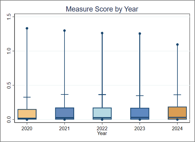
About Figure 1: Figure 1 is a boxplot that shows how scores have changed based on the most recent 5 years of data available. For each year, the boxplot displays a box with lines and dots to help visualize the range and distribution of scores. The dots represent the points where the lowest 5% and highest 5% of scores fall, and the line connecting them shows where 90% of the scores are located. The box itself covers the middle half of the scores, from the 25th to the 75th percentile. Inside the box, a horizontal line marks the median score, which is the middle value, while a “+” sign shows the average score. This type of graph makes overall trends in scores over time as well as the consistency and spread of the results easier to understand.